Changelog
We ship product updates weekly. Follow us on 𝕏 for the latest.
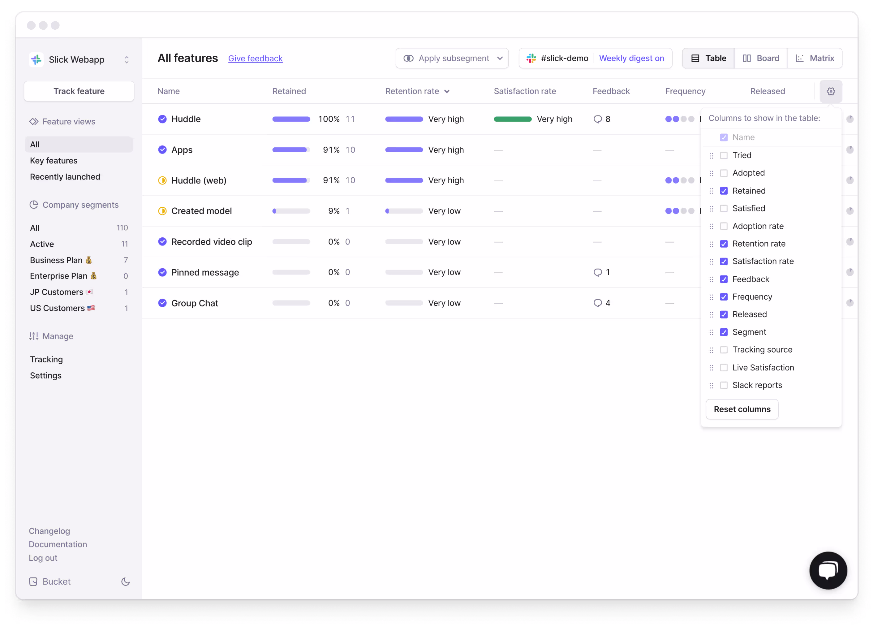
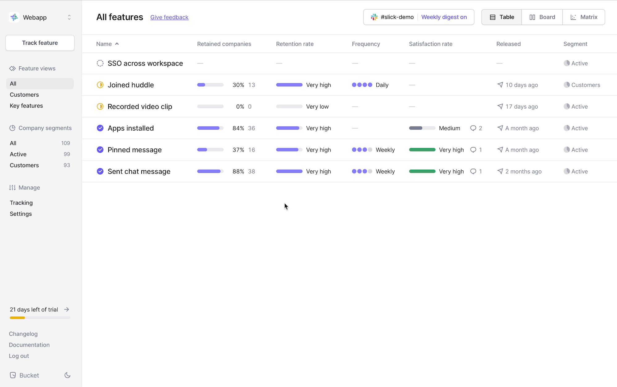
Configure and customize table columns
We’ve just shipped an improvement that allows you to add, remove and reorder table columns across the Bucket app. We have also added more metrics to the feature view table.
See it in action
To start customizing the table view, click on the ⚙️ icon on the right. You can now:
- Show or hide selected metrics simply by toggling the checkmark
- Re-order the table columns via drag-and-drop
- Use “Reset” to revert to the default table view
This improvement works across the whole Bucket app – everywhere where data is presented in a table format. But it really shines in the feature view table:
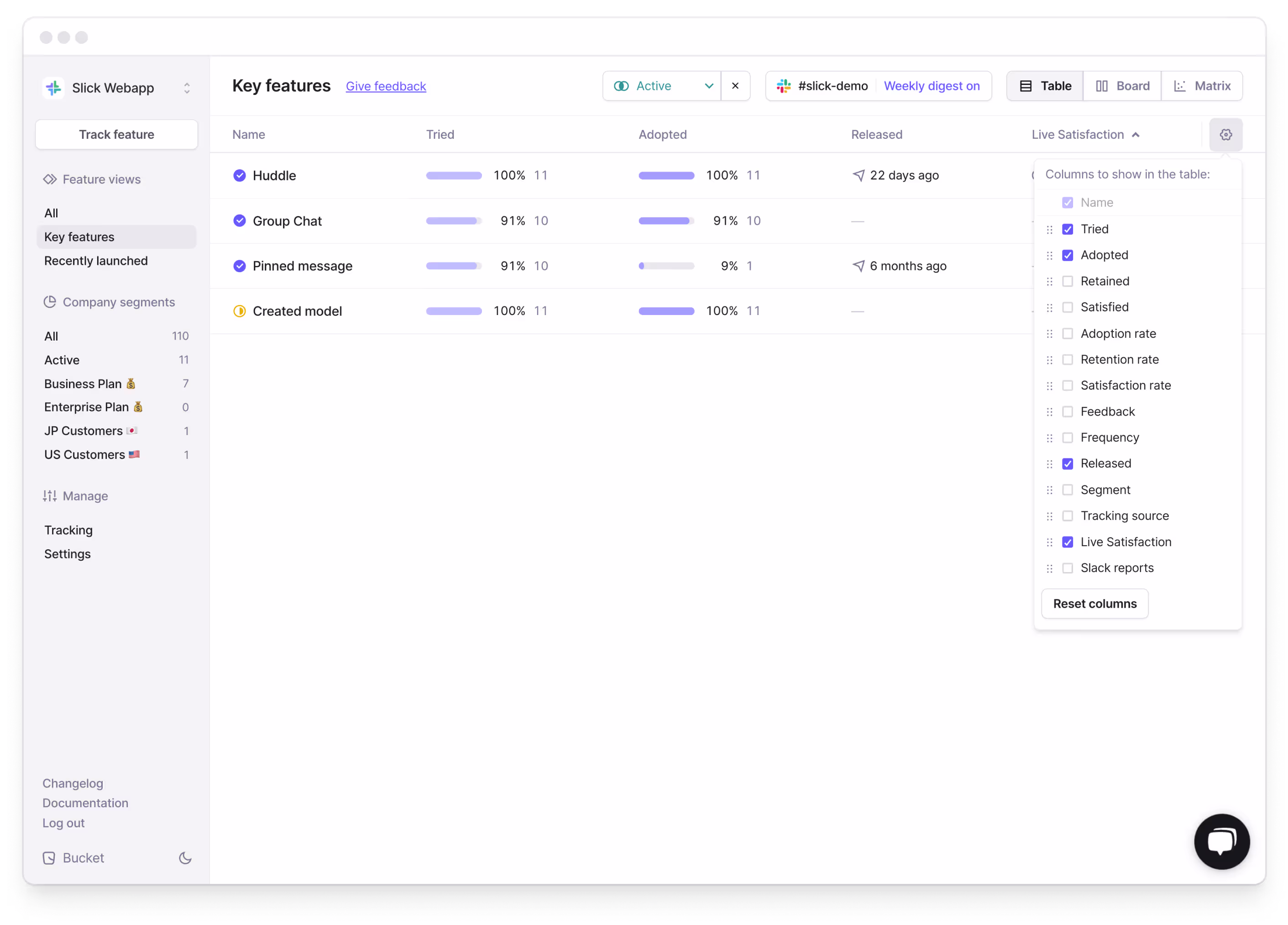
How can I use this?
For example, you can now add the “Tried” and “Adopted” metric to the feature table view, then sort the table by release date and get a quick overview of how your recently launched features are performing.
More Use Cases
- By selecting specific subsegments and adding the STARS metrics to the feature view table, you can visualize the STARS funnel for all your features for specific segments.
- Go into focus mode by only showing specific metrics in the feature table view, for example during different stages of a product release cycle.
- Show the feedback count and Satisfaction rate to quickly gauge what features are receiving feedback and how satisfied your users are with it.
- Add the “Live Satisfaction” and “Slack Reports” columns to see which features have them enabled.
- Save specific table layouts or make them accessible for other team members by sharing the custom URL with them.
Get started with Bucket in minutes
Bucket connects to your product via Segment and through our API, so getting started is easy. Empower your product team and unlock feature value by combining product analytics and qualitative feedback – all in one place.
Having everything we need to make product decisions in one tool is a big time-saver for us.
Robert H., Product Owner @ Billetto
Click here to get started for free or click here to book an intro.
Introducing Live Satisfaction
We are introducing Live Satisfaction – a no-code approach to collect qualitative user feedback for your features right from within Bucket. This makes Bucket your one stop shop for both quantitative product insights and qualitative user feedback on a feature level. Every feedback and satisfaction rating flows directly into the “Satisfied” metric in Bucket – which you can explore in the feature report. This will help you understand whether customers are satisfied with a feature in general.
How it works
Gathering insightful feedback is pivotal for steering your product in the right direction and to evaluate what your users think of a specific feature. And gathering the right feedback at the right time is just as important.
Watch the video below to see how you can easily start collecting feedback for your features from your users, right within Bucket:
The importance of qualitative user feedback
Feedback from your actual users is a rich source of insights that provides a deeper understanding of how your users think about your product.
While quantitative data is excellent for measuring metrics and identifying trends, qualitative data, for example the written feedback provided by your users, uncovers the “why” behind those numbers and helps to understand the motivations of your users, their frustrations, and overall sentiment – painting a complete picture of how your features are performing and perceived.
Bucket enabled us to start collecting qualitative user feedback, which plays a critical role in how we evaluate features.
Robert H., Product Owner @ Billetto
Today, most product teams either use different tools to gather qualitative user feedback, only collect company-wide NPS or don’t collect any user feedback on a feature level.
Getting started is easy
To get started, head over to the Bucket app, select the feature you would like to start collecting feedback on, go to Settings and click on “Enable Live Satisfaction”.
That’s it! You’re now collecting satisfaction - live!
In its default state, the feedback widget collects a simple customer satisfaction score and also gives the user the option to leave a comment. Please note that this widget will be hovering on the bottom right of your app.
You can now:
- Define the question you would like to ask your users.
- Define the minimum interactions before a user gets asked for feedback. This is useful if you want to collect feedback from users at different stages of the STARS funnel.
- Set the minimum and maximum time (in seconds) after an interaction for the feedback widget to be shown.
To learn more, head over to our documentation here.

Fully customizable

As product builders ourselves, we understand you want to have maximum control over the experience in your application. And to enable you to make collecting feedback in line with your design and user interaction guidelines, the behaviour, language, as well as the design of the feedback widget, are fully customizable via CSS.
To check out what and how to customize your feedback widget, go check out our documentation here or head over to GitHub for the full developer documentation.
Make feedback collection a part of your workflow with Bucket
Live Satisfaction is a major addition to Bucket's repeatable feature evaluation workflow:
Launching and evaluating features
Bucket is built upon the STARS framework, a funnel that, at its core, lets you understand the engagement and satisfaction of users for all your features. It measures feature satisfaction and enables you to evaluate feature performance consistently and for every feature you launch.
Compare and audit feature performance
All your features that are launched through Bucket are evaluated on a consistent framework, making it possible to analyse and compare feature performance. Use the Audit Matrix and Subsegmentation to compare feature adoption, retention, and satisfaction across different customer segments.

Measure customer satisfaction per feature
After you launch a feature or identify one that needs further investigation, it is easy to start collecting feature-specific user feedback with Live Satisfaction. All the collected feedback is seamlessly integrated into the Feature Report.
Integrate enriched Bucket data to make informed product decisions
Bucket is designed from the ground up to give Product teams fast & actionable insights. With our recently launched Data Export you can go one step further and easily integrate Bucket-enriched data into your own workflows, data warehouses or use it to strengthen cross-team collaboration by making it accessible to other teams, for example Customer Success.
Let’s recap
- You can now use Bucket to collect qualitative feedback from your users for specific features.
- To get started, head over to the settings for the feature you’d like to start collecting feedback for, enable Live Satisfaction and set a question.
- Both the design and behaviour of the feedback widget are fully customizable, making sure you are aligned with your design and UI Guidelines and allowing you to implement feedback collection seamlessly into your product.
To learn more about enabling, customizing and deploying your first feedback widget, head over to our documentation here or check out the full GitHub documentation here.
Get started with Bucket in minutes
Bucket connects to your product via Segment and through our API, so getting started is easy. Empower your product team and unlock feature value by combining product analytics and qualitative feedback – all in one place.
Having everything we need to make product decisions in one tool is a big time-saver for us.
Robert H., Product Owner @ Billetto
Click here to get started for free or click here to book an intro.
Introducing Subsegmentation
We've rolled out Subsegmentation to enable comparisons of feature adoption, retention, and satisfaction across different customer segments – allowing you to get a deeper understanding about what features specific customer cohorts use and how satisfied they are with them. Understanding which features matter to your customers in different segments is business critical – be it customers on different pricing plans or in different parts of the world.
Subsegmentation shines in the Audit Matrix
Subsegmentation works across the Bucket app, but is especially useful in the Audit Matrix. On the feature table and board view, you’ll find the new option to select and apply one of your company segments. In the Audit Matrix you can select multiple company segments which lets you easily compare how specific features perform with different company segments.
How do I use it?
Pick your features, as well as one or multiple segments you wish to compare. Your initial view will give you quick insights into how different customer segments have received your features.
This allows you to compare how a particular feature has been adopted in Japan versus in the US, or highlight feature satisfaction for customers on a Business pricing plan versus customers on the Enterprise pricing plan.
We’ve also added the ability to dig deeper into the data for a particular segment by clicking the dot on the matrix. This takes you to the feature report filtered for that particular segment:
The data in the segmented feature report is calculated in the same way as the regular feature report, but it only includes the companies in the segment you have selected.
These additions together let you compare and contrast feature success across different customer segments as well as dig deep into the data for a particular segment of your customers on a particular feature.
Let’s recap
- A feature’s target segment specifies which customers have access to your feature. The feature report uses this segment by default.
- Think of Subsegmentation as a “magnifying glass” that allows you to zoom in and understand feature engagement for specific company segments.
- By comparing multiple subsegments, you can spot trends in feature engagements, for example how adoption varies between customers on different pricing plans or in different regions.
Get started with Bucket in minutes
Bucket connects to your product via Segment or through our API, so getting started is easy. Empower your product team and unlock feature value with product analytics & qualitative feedback – all in one place.
Click here to get started for free or click here to book an intro.
Introducing Data Export
We’ve added the option to export your Bucket data as a CSV file – so you can work with your data in your own data warehouse, your CRM or good old-fashioned Excel.

The data export feature enables you to download the complete feature usage of every company for every feature you’re tracking. To get started, log into Bucket, go to App Settings and click on the "Data export" tab. Here's a snapshot of what you can expect from your data export:

How can I use this in my company?
Bucket is designed from the ground up to give you fast and actionable insights into your product. By downloading Bucket’s enriched feature data, you can manipulate it as needed, import it into other systems or create custom reports to answer questions the Bucket UI does not yet answer. For example:
Create 360-degree customer profiles
Integrate key feature adoption metrics into your CRM for a comprehensive view of each customer’s interaction with your product.
Engage specific segments
Find customers with high satisfaction but low feature usage frequency, and re-engage them with targeted messaging.
Discover your power users
Just like in the screenshot above, use the Bucket data to determine who your power users are by filtering for those who are ‘retained’ for any combination of key features.
Create custom visualizations
Use the available historical data aggregations to create custom visualizations. For example, you can map out adoption rates over time or create cohort-style visualizations for feature adoption.
Time your feature launches
Plan feature releases aligned with high-usage periods based on the available historical data aggregations of the Bucket data export.
To learn more about the technical details and content of the data export, check out the documentation here. We'd also love to hear how you're planning to use the enriched data; feel free to reach out to us.
That’s it for now—happy data crunching! 📊
Inspect event attributes and see related features
We’ve just made it easier to debug event data and to turn any event into a Bucket feature.

The Tracking view now shows event attribute values when inspecting an event. This enables you to ensure and/or debug that the correct attributes and attribute values are in fact attached to the respective event.
In the new Related features section, we’ll show any features that are associated with the respective event. If none are, you can click Track new feature to easily transform the raw event into a Bucket feature with a single click.
More updates soon!
Analyzing feature usage and satisfaction at the company-level
We’ve just shipped an update to the company view that enables you to view feature engagement and satisfaction through the lens of a single company account.

In the screenshot, we’re looking at the “Feature usage”-tab for the “Prodash” company.
For each tracked feature, we can see where the company is in the STARS funnel, if they’ve provided any qualitative feedback to the respective feature, when they used it last, and what their feature activity looks like over the past 30 days.
We’ve also added tabs to this view so that you can browse feature usage (screenshot), all feedback and satisfaction scores provided by the customer, users in the account, and all attributes for the company.
The view unlocks a bunch of possibilities, like ensuring that key accounts are aware of, and using, most key features, upsell opportunities and for checking in on new feature adoption and satisfaction by certain accounts.
More updates soon!
Sorting the features table
It’s now possible to sort the feature views by column. This enables you to quickly get a list of features with the highest retention, the lowest satisfaction, most frequency of use or latest release date.
This can help you detect key features with high retention but low satisfaction scores more easily. To understand why the satisfaction scores are low, and why the customers might be a churn risk, dive into the respective features and check the qualitative feedback from your customers.
Or, like shown below, this can help you surface opportunities. For example, features that are successful - with high frequency and/or satisfaction - but with low adoption or awareness.
More updates next week!
Introducing the Audit Matrix
Note: This post contains GIFs and therefore might take a few seconds to load.
Using the STARS framework on Bucket, you can quickly establish a consistent baseline for customer engagement and satisfaction of any feature.
But how does one feature compare to other key features in your product? And how do those comparisons change over time?
Answering those critical questions has just gotten a whole lot easier as we’re introducing the Bucket Audit Matrix!
The latest Bucket update introduces an essential feature for any product leader. An intuitive visual that charts all of your features side by side including changes over time with trendlines.
The Audit Matrix
The matrix is a wonderful visualization for comparing features side by side across two dimensions. The default typically shows adoption on the x-axis and frequency of use on the y-axis.
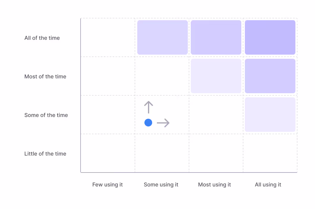
In B2B SaaS, most customers should be using key features at least once every subscription cycle. If customers don’t, they’re likely becoming a churn risk.
Therefore, if you have a monthly subscription cycle, you want to make sure that the key feature frequency is at least monthly, and ideally weekly or bi-weekly. If the feature isn’t used often and is a key feature for customers, you want to work on moving the feature upwards.
Then once the feature is sticky, you want to move it to the right and get more customers to use it.
Lastly, once the metrics look good, you want to increase customer satisfaction to make sure customers are happily retained.
Demo
Let’s see what the Bucket Audit Matrix looks like in action!
In this example, we’re looking at our fictional Slack competitor “Slick”. We’re tracking two recent feature releases - huddles and video recordings - and comparing them to one of our key features - sending chat messages.
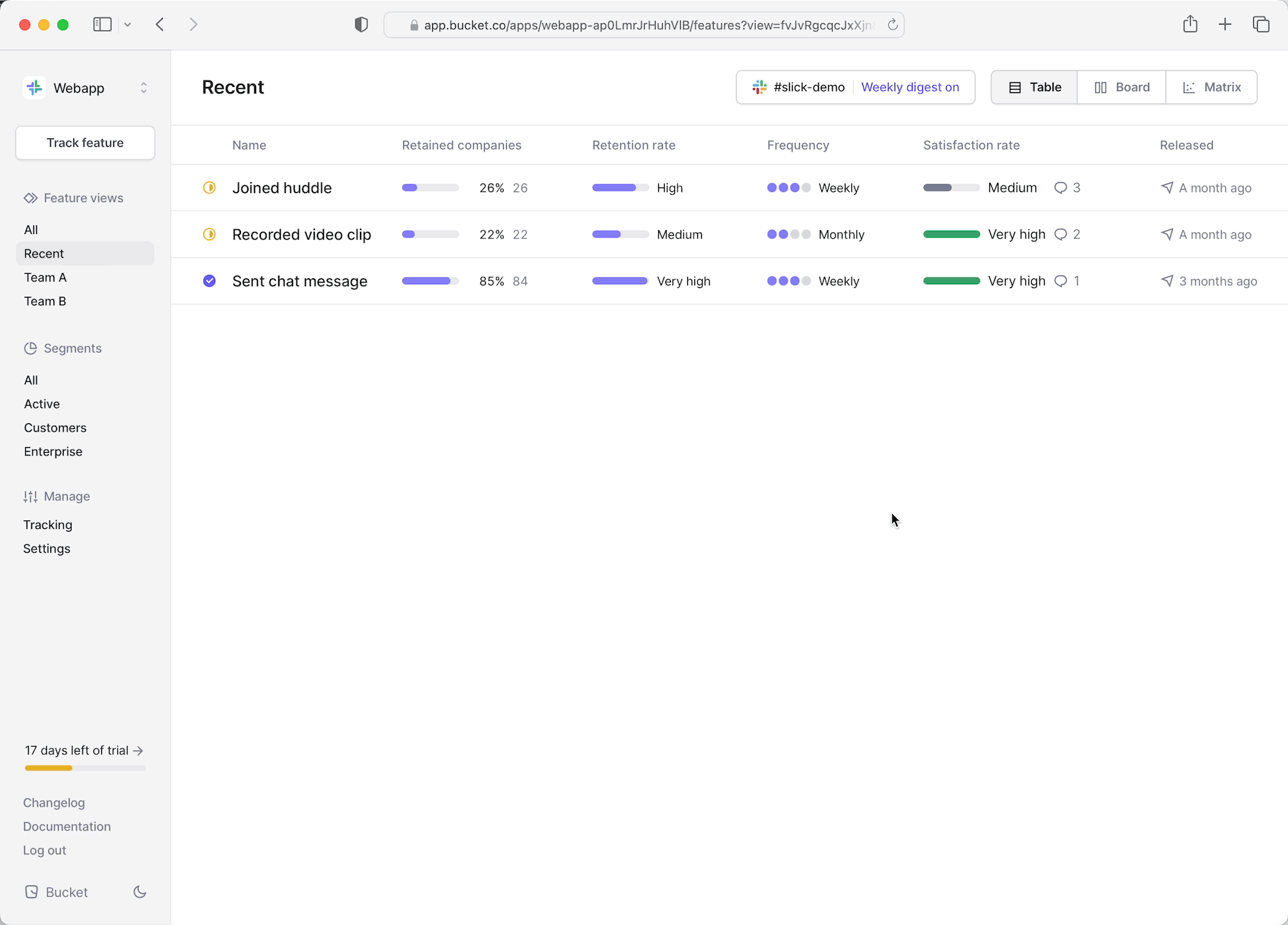
From the list view, we jump to the matrix comparison view. We can quickly tell that our new features (marked yellow as in evaluation period) aren’t seeing the same engagement as our key feature.
We can even see in the trendlines that the engagement has been decreasing drastically since the initial release. Users showed interest and tried the features but didn’t really find them valuable enough to keep using them.
That’s alarming! The huddles feature is intended to be a new key feature in our Slick product.

To investigate further, we swap the frequency axis with satisfaction - the qualitative layer on Bucket - to see how the features compare in this dimension. As feared, the satisfaction scores aren’t very high.

To learn why, we click the huddle feature to dive into the actual customer feedback. Here’s one piece of feedback:
"We'll stick with Zoom until we can use huddles for all-hands, too"
This indicates that the huddles feature is appealing but simply not feature-rich enough to be a viable alternative to something like Zoom.
So, we’ve validated the feature idea based on initial adoption (interest) and qualitative feedback, but we’ve also discovered that we need to invest in this feature to make it successful. If we do so, there’s a good chance we can move it up and to the right on the audit matrix, and grab a chunk of Zoom!
Get started today
The Audit Matrix is one of the most powerful visualization methods in a product leader’s toolbox and indispensable at any roadmap planning meeting. It works out of the box on Bucket as all features are tracked using the STARS framework and therefore comparable on the same axes.
To get started, simply start at Free trial and navigate to the Matrix view in the top right corner.
Happy roadmapping! 🏄
Introducing qualitative feedback
Our mission is to empower product teams to deliver impactful features that delight and retain customers. Today, we’ve added a major addition to our service that brings us closer to our mission:
Introducing in-app qualitative feedback!
Bucket already provides product teams with turn-key engagement metrics for the features they ship. We instantly answer common questions, like “Who adopted the feature?”, “Who’s retained?”, “Churned?”, “How do these metrics look for our enterprise customers?”.
Today, we’re adding the ability to also collect in-app customer feedback, so you can complete the feedback loop. By combining quantitative analytics with qualitative feedback you’ll be getting the full picture - in one place - so you can quickly determine customer satisfaction of any feature.
Collecting in-app feedback
Whenever you release a significant feature update, use in-app feedback to provide your customers with an easy way to let you know what they think of it.
Here’s an example of what that could look like:

Once submitted, the feedback gets shared on Slack. As you can tell, the feedback is already associated with the “Account revenue chart” feature on Bucket.

On the “Account revenue chart” feature page on Bucket, you’ll now see a Feedback tab where all the feedback about this particular feature is listed:

Having feature engagement metrics and feedback on one place is powerful for several reasons:
Firstly, it provides you and your product team with a single pane of glass for your features, which enables you to get an overview of customer engagement and satisfaction, and act on it fast.
Secondly, Bucket augments the customer feedback with the customer’s actual feature engagement, like frequency of use, what other features they’re using, how many users they have, and so on. The engagement data helps you understand if the feedback is coming from a new account that is trying the feature for the first time - or from a long-time enterprise customer that has been using it for a while.
Having that context enriches the feedback so you can understand where it’s coming from and prioritize accordingly.
Getting started
Feedback is now built-in to the Bucket SDK and supported by our HTTP API. To enable your customers to provide feedback, go to Bucket and track a new feature or find an existing one. You’ll need the “featureId” from the new Feedback tab. Then, create a custom, re-usable form that gathers feature satisfaction score (CSAT) and a comment, and send the data to Bucket via the SDK or API.
Here’s an example of how to use the Bucket SDK:

That’s it!
Now you can easily add in-app feedback collection to any new feature release.
By the way, if you gather feedback via email or calls, you can enter it manually on the Feedback tab.
More updates on this topic soon! ;)
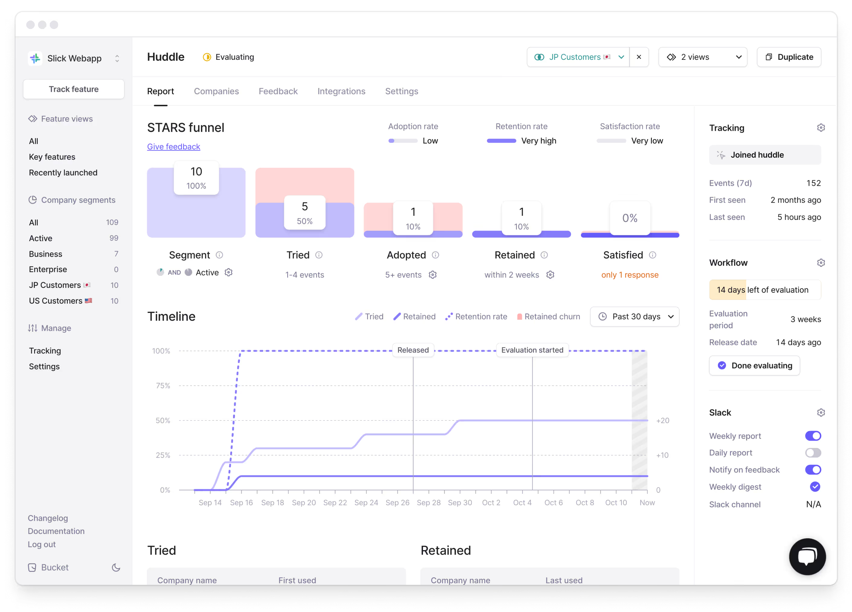
Introducing the feature evaluation workflow
Todo -> Doing -> Done. But what happens when a feature is marked as Done? It’s deployed and live with the customers. That’s undoubtedly the most crucial time in the feature cycle, and that’s exactly where existing workflows stop today.
It’s nuts!
At Bucket, we want to add a final step to the feature delivery workflow: The Evaluation step. In the Evaluation step product teams make sure that their customers actually like the feature they’ve released. We believe most features should go through this step.
We’ve come to expect almost every other step in the feature delivery workflow, like testing, deploying to production etc, to be automated. We believe that the evaluation of features should also be as automated as possible.
Last week we announced how you can plan features on Bucket. The Planned state is for when the feature is in development.
Today, we’re announcing the remaining states: Evaluating and Done. Together, they make up a complete, automated feature evaluation workflow.
Automated evaluation
When you log in today, you’ll see these columns: Planned -> Evaluating -> Done.

When a Planned feature is deployed (and marked as Done in JIRA or Linear), it automatically goes into Evaluating mode on Bucket.
Bucket reports engagement metrics on all features in Evaluating mode to Slack every Monday.
When you have enough insights to decide if the feature has reached the impact you expected from it, you mark it as Done on Bucket. If the feature needs more work, you rinse and repeat the workflow.
Release date
We’ve also shipped the ability to set a Release date for each feature. You can set it manually or let Bucket do it. Once data for a feature starts flowing in, the feature changes state automatically from Planned to Evaluating, and Bucket will automatically set the release date to the current date if a date isn’t already set. You can modify the release date later, if needed.
The release date will also appear in the Slack reports, so you can easily track how long a feature has been in evaluation.

After 2-4 weeks, you should start to see leading indicators on adoption and churn, which will indicate feature success or not. If you need to dive deeper and speak with customers, Bucket makes that very easy, too.
Happy shipping!